


Side Hustle Bootcamp Portfolio: Life Expectancy Analysis (2000-2015)


The past week marked the grand finale of the Side hustle Bootcamp. My learning journey in the past one month has indeed been rewarding.
As the final project for the Bootcamp, my team was assigned the task of working on a life expectancy insight analysis on a selected country. The analysis was to answer the following data questions:
Do various predicting factors which has been chosen initially really affect Life expectancy? What are the predicting variables actually affecting life expectancy?
Should a country having a lower life expectancy value(<65) increase its healthcare expenditure in order to improve its average lifespan?
How do Infant and Adult mortality rates affect life expectancy?
Does Life Expectancy have a positive or negative correlation with eating habits, lifestyle, exercise, smoking, drinking alcohol, etc?
What is the impact of schooling on the lifespan of humans?
Does Life Expectancy have a positive or negative relationship with drinking alcohol?
Do densely populated countries tend to have a lower life expectancy?
What is the impact of Immunization coverage on Life Expectancy?
Step 1: Sourcing for the data
The data for the analysis was sourced from Kaggle. The dataset contained 22 columns and 2938 rows. Each row contained countries with their corresponding data from 2000-2015.
Step 2: Loading and Transformation
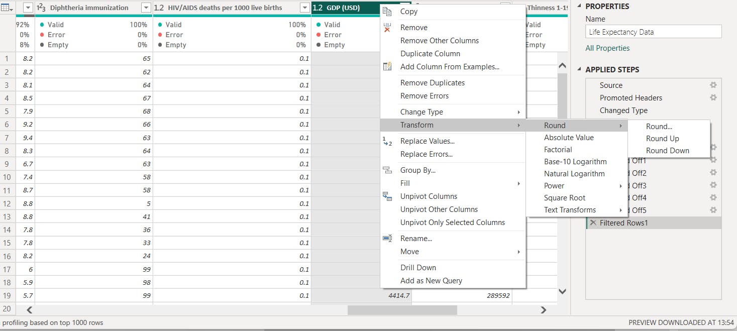
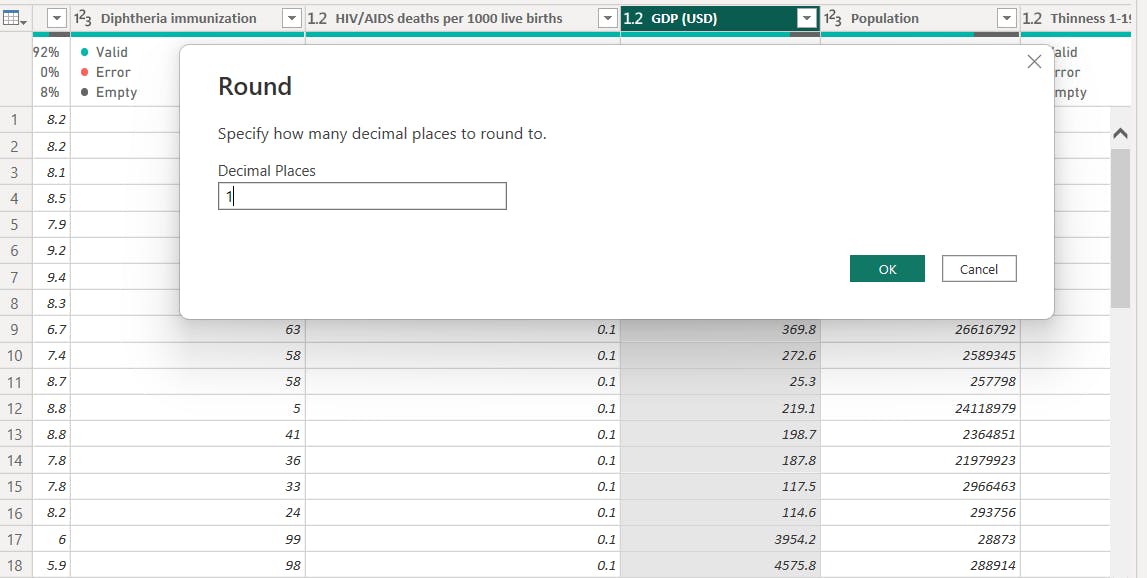
After importing into PowerBI, the dataset was transformed with Power Query. Columns with decimal numbers had the decimal place (d.p) rounded from 2 d.p to 1 d.p. "GDP" column contained numbers with more than 4 d.p and was rounded to 1 d.p. This was done by right clicking on the column to bring up the drop down menu. Then clicking on transform to round to the desired decimal point. Some column names were changed in the dataset.
Step 3: DAX and Visualisation
The next step after transformation was to analyze the data. A new measure was computed from the column containing data for life expectancy for each country in years.

Using the column tool, the summarization of columns with numerical data was changed from sum to average. This was because taking the average clearly represented the data for each country over the years.
The datasets was then visualized using line charts, cluster bar charts, tables and scatter plots.
The dashboard

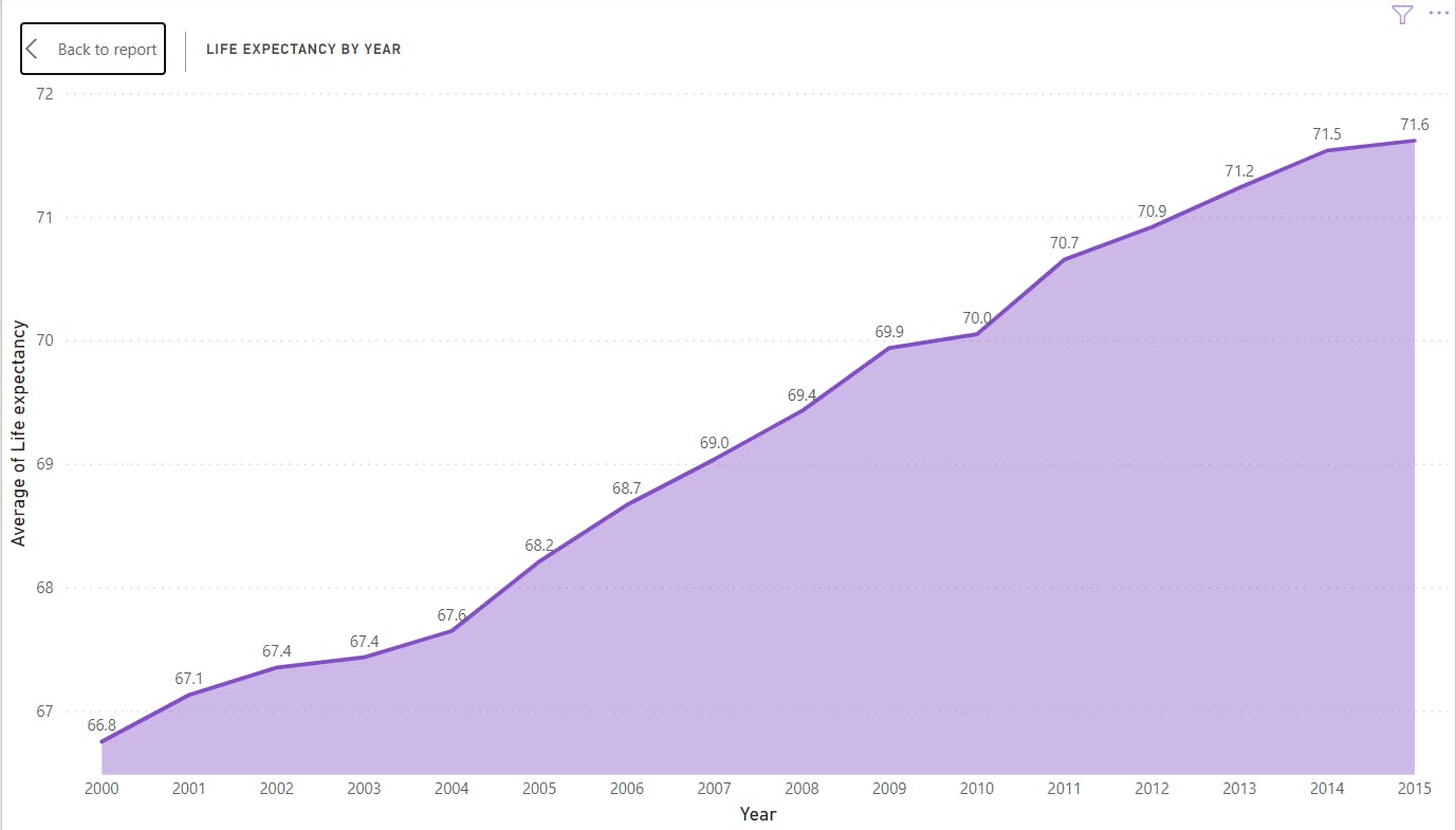
The line chart above, showed a global uptrend in life expectancy from 2000 to 2015.
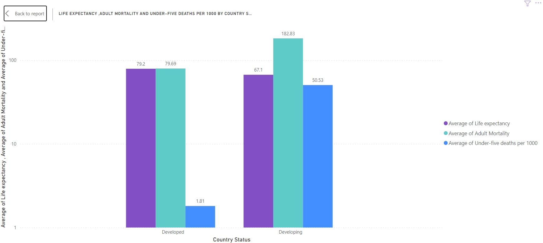
The chart compares life expectancy, adult and infant mortality between developed and developing countries. From the chart we see higher life expectancy, lower adult and infant mortality in developed countries. A contrast is seen in developed countries.
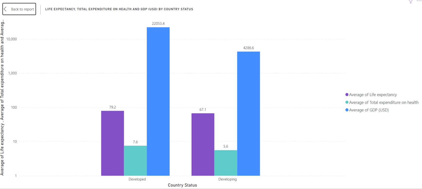
The next chart above, compares life expectancy, GDP and expenditure on health in developed and developing countries. GDP and expenditure on health are seen to be higher in developed countries compared to developing countries.
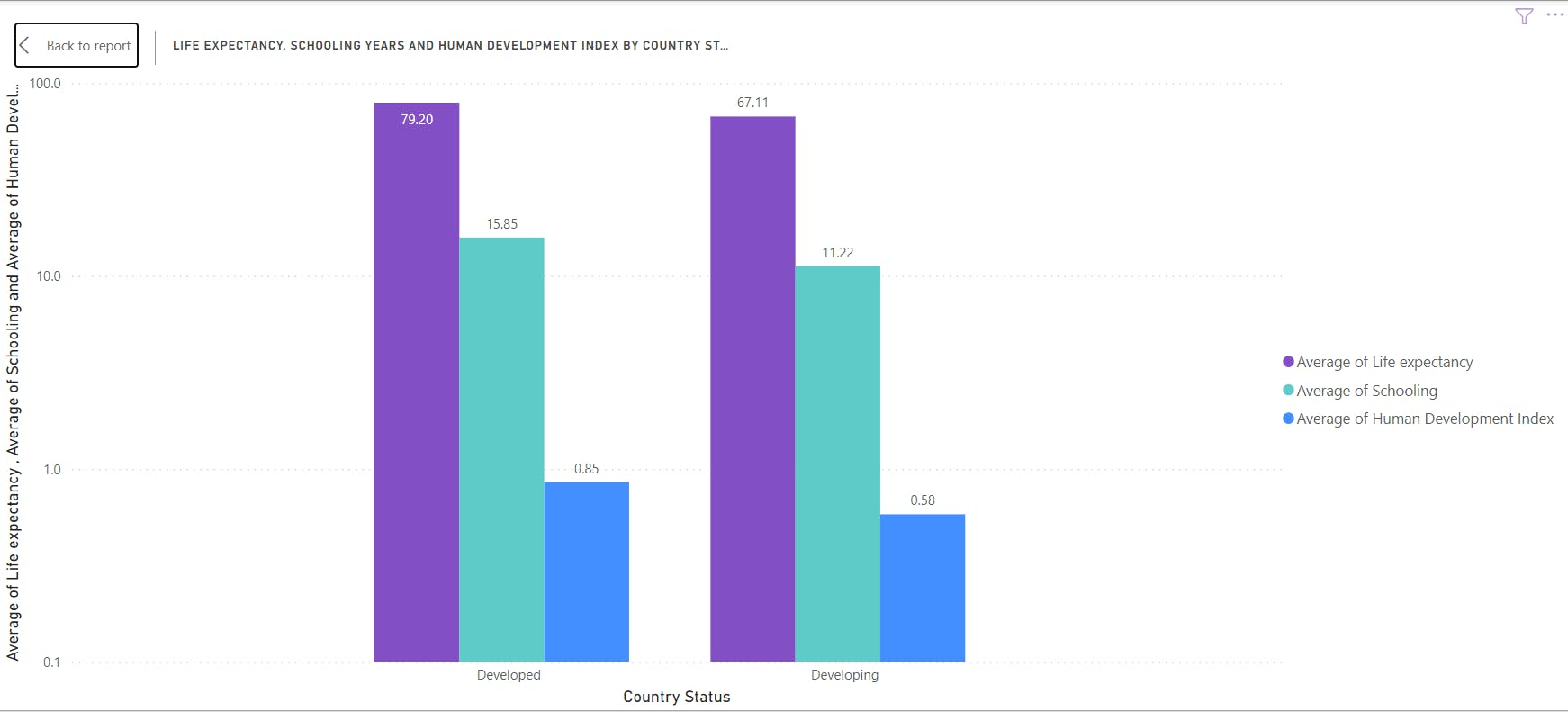
The next chart compares life expectancy, years of schooling and human development index (HDI) between developed and development countries. Years of schooling and HDI are higher in developed countries than in developing countries.
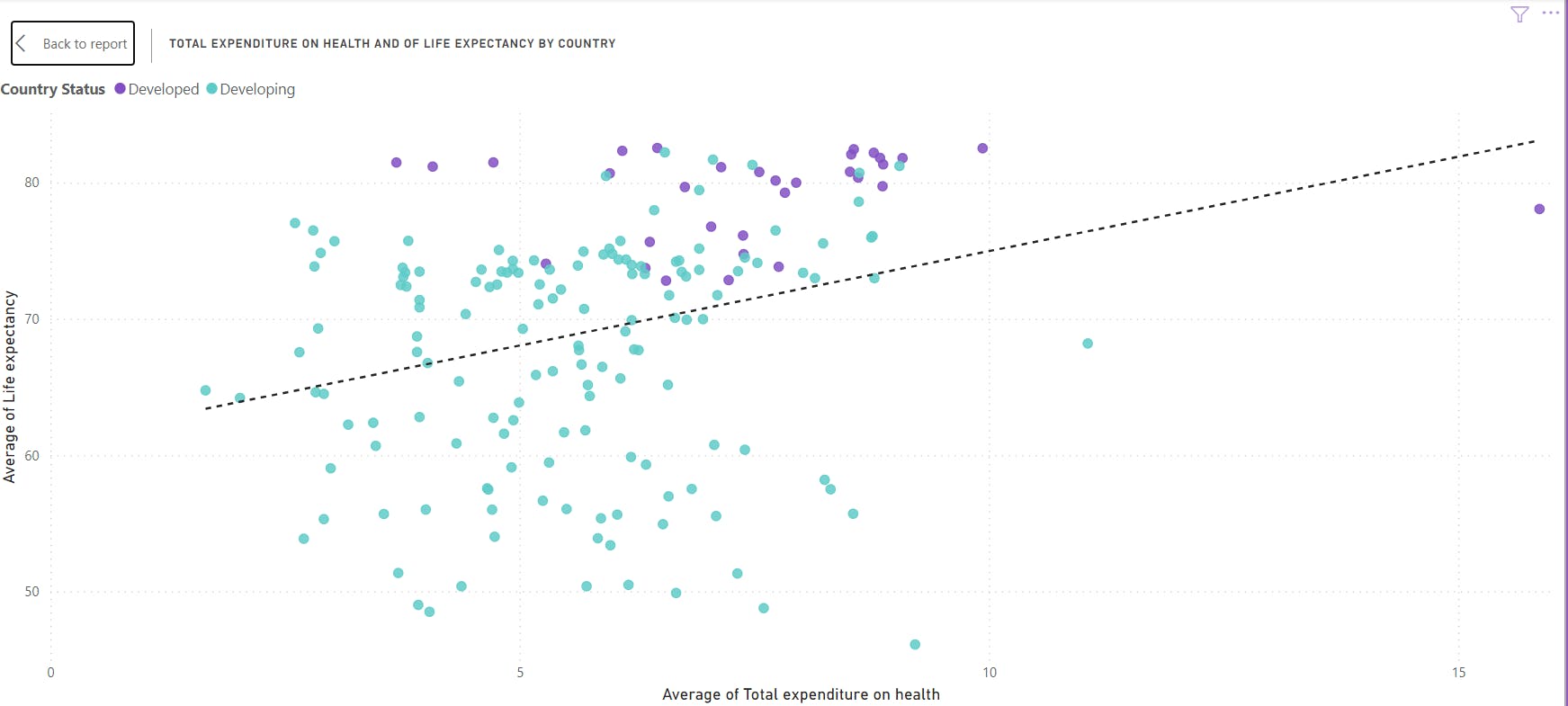
Scatter chart was used to determine the relationship between life expectancy and expenditure on health in both developed and developing countries. As seen by the trend line, a positive correlation is observed between the two variables.
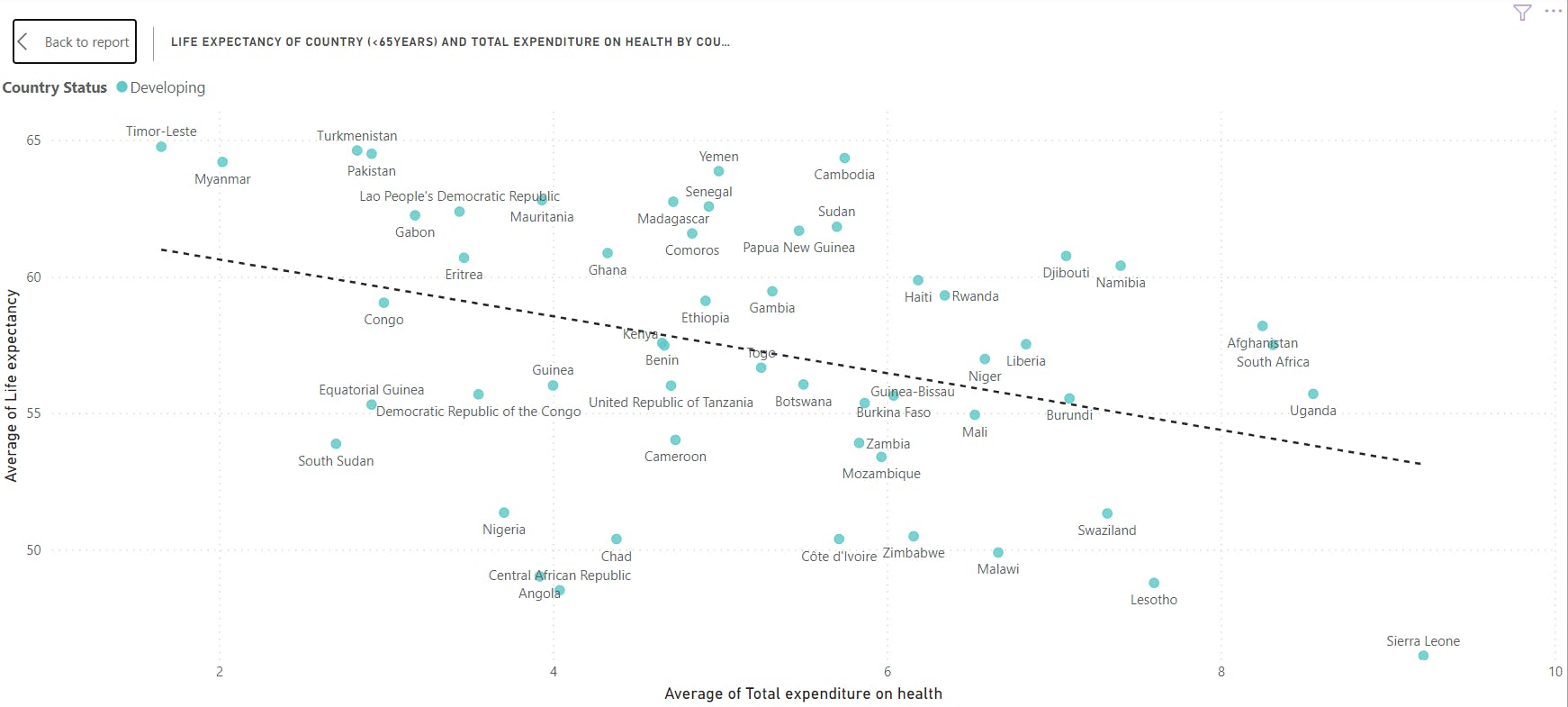
For countries with an average life expectancy of <65 years, the chart above shows a negative correlation between life expectancy and total expenditure on health.
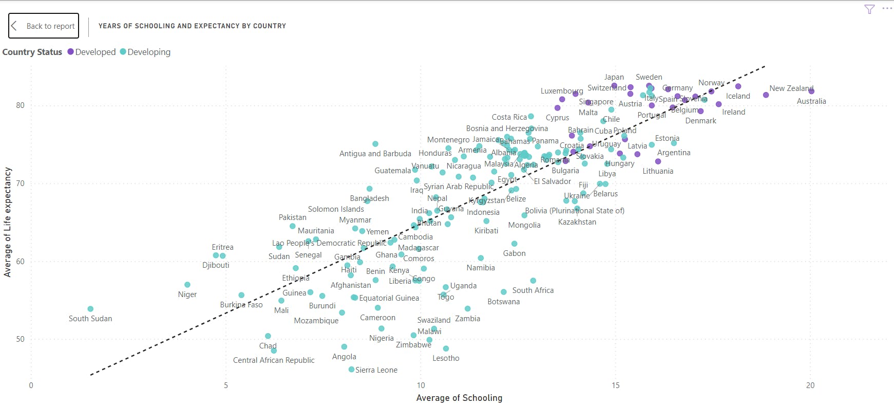
The line chart above shows a positive correlation between years of schooling and life expectancy. As seen in the chart, developed countries are clustered at the point corresponding to higher life expectancy and longer years of schooling.
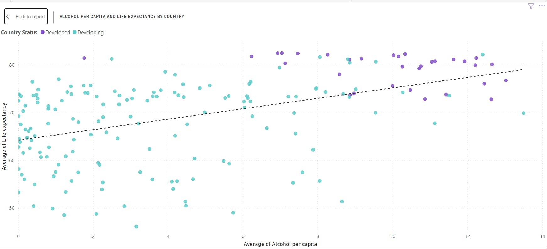
In the chart above, alcohol consumption per capita showed a weak positive correlation with life expectancy. Again more developed countries clustered at the region of higher life expectancy and more alcohol intake.

The next chart above shows a weak negative correlation between population and life expectancy.
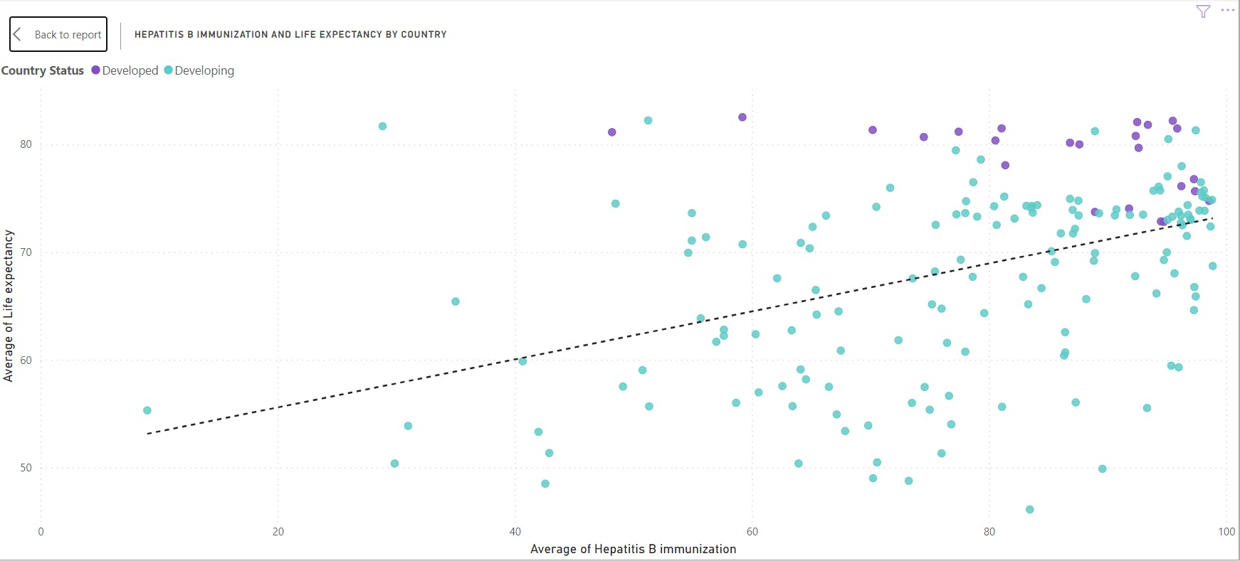
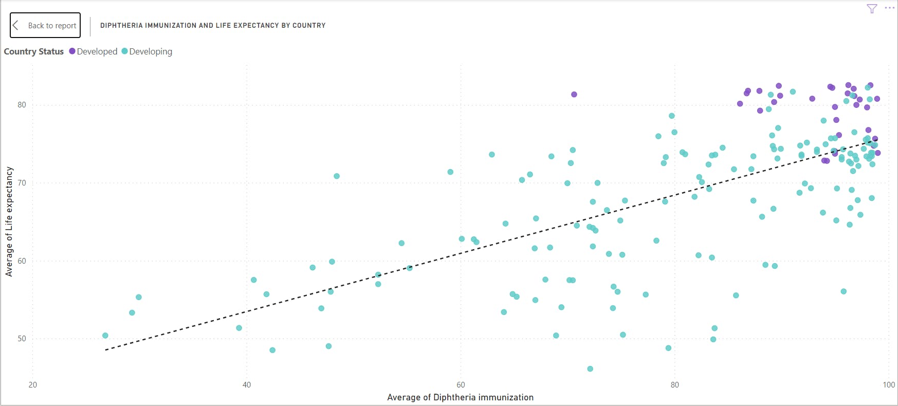
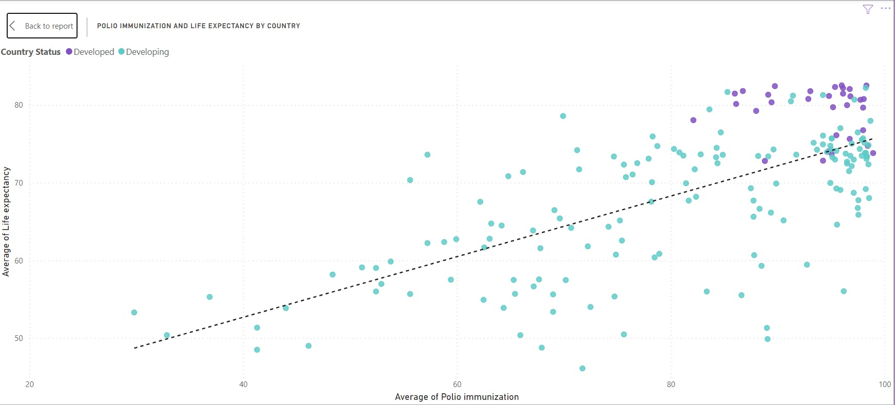
In the next charts below, we can see a positive correlation between life expectancy and immunization coverage for Hepatitis B, Diphtheria and Polio respectively.
Hepatitis B immunization and life expectancy
Diphtheria immunization and life expectancy
Polio immunization and life expectancy
In summary, from 2000 to 2015, global life expectancy improved from 66.8 years to 71.5 years. Developed countries had higher life expectancy compared to developing countries. Compared to developing countries, developed countries had lower adult and infant mortality. In terms of GDP, total expenditure on health, years of schooling and human development index, developed countries rate higher than developed countries. Years of schooling positively impacted life expectancy while countries with dense population tend to have lower life expectancy. Immunization coverage had a positive impact on life expectancy.